Table of Contents
About the Authors
| Rachel Lee Associate Professor of Instruction, Writing, Speaking, and Argument Program, University of Rochester |
| Emily Sherwood Director, Digital Scholarship, River Campus Libraries, University of Rochester |
About the Tool and Class
| Title | Personal Infographic |
| Tool | Infographics – This iteration of the assignment used Piktochart with an educational license. Canva is another online infographic program that is currently free. Both are online visualization platforms to create infographics using easy-to-use templates and drag-and-drop organization; accessed under educational licenses |
| Class/ Target Level | College students who have completed the Primary Writing Requirement; college students completing their upper-level writing requirement (e.g., Digital Media studies) |
| Course Title | Writing in a Digital World (a writing course cross-listed as English and Digital Media Studies) |
| Background Information About the Class | The purpose of writing in a digital world is to engage with a broader community around a topic of interest and contribute to public knowledge through various genres and media. Course themes include digital identity, digital literacy, and multimodal argument. Course projects are multimodal, engage a specific audience, and demonstrate students’ ability to think critically about a topic and effectively communicate that knowledge to a range of readers. |
| Lesson Time | 4 class sessions (including theoretical framing, scaffolding, and in-class peer review & revision workshops) |
| Learning Objectives | The purpose of this class is to explore the fundamental principles of writing in digital spaces. One major assignment was a portfolio exploring digital identity through text, image, and data. The personal infographic module was part of the larger portfolio assignment and targeted these specific learning goals: |
Lesson Plans
The module spanned several class sessions in order to build in time to develop students’ rhetorical awareness around infographics as a genre as well as to provide students with some low-stakes practice creating infographics before they began their own drafts. The sequence also integrated a well-supported writing process including drafting, peer response, instructor feedback, self-reflection, and revision. This scaffolding of key learning goals through a variety of activities helped students understand general conventions surrounding infographics so that they could make their own informed choices as communicators, and then “test” those choices through peer response.
Lesson Plan 1
Opening
Homework due this day:
- Reading: blog post on data privacy and short video art project on analog representations of unconventional personal data
- Writing: personal data reflection: Choose any platform you use. Figure out if even you can download your data. Document any difficulties that arise in the process. Inspect your data. How much can you access? In what form? Does anything about this data surprise or concern you? Is it in an accessible and meaningful format? Would you want the whole class to have access to it? Your school? The state? Why or why not?
Goals:
- Understand various contexts for using/representing data (including personal data; including artistic/creative contexts)
- Develop some genre awareness for data visualization
- Develop awareness of process for representing data (specifically, the interpretive challenges of data selection and representation)
Body
Group discussion on personal data and privacy (e.g., should we be concerned about data privacy? Why/why not?)
Small group discussions on homework reflections (What personal data did you find in your chosen platform? Any surprises, challenges, questions, or concerns? Would you want others to access your personal data? Why/why not?)
Shift to visual representations of data: Previous experience with visually representing data? Purpose for visual representation of data in academic contexts? How does data visualization work in the digital world more broadly?
Discuss two (very different) examples of data visualizations (conventional & artistic): How do these work? What do or don’t they tell us about the data they represent? What questions do they raise? How does the process of visualizing data help us to discover, explore, and show hidden connections and patterns?
Individual Activity: represent your browsing history
- Access your browser history
- Categorize in terms of use: personal, professional, academic
- Create an analog visual representation of your data (note card and colored pencils)
Share out/discuss activity (Any discoveries, connections, or patterns in your own data?)
Closing
Homework for next class:
Reading: article on visual rhetoric in digital writing (Mary E. Hocks (2003), “Understanding Visual Rhetoric in Digital Writing Environments” (pp. 629-656).)
Writing:
- Find an infographic that catches your attention (interesting, troubling, good example, bad example, etc.). Who is the intended audience? What is the purpose of the infographic?
- Brainstorm data points for your personal infographic. What kinds of data would be interesting to include and why? How might you locate or record this data for your infographic? How might you use visual design to effectively communicate this data to viewers?
Findings/Assessment
During discussions, students explored various aspects of the complex issue of personal data and data privacy, articulating a range of different perspectives and stances.
Looking at specific examples of data visualization helped students explore the ways in which academic or creative visualizations (for instance) work to communicate specific messages about data to target audiences.
Representing their own data quickly revealed the interpretive challenges related to understanding and representing data; it also revealed important questions about audience and purpose (Who will see this? Why?).
Lesson Plan 2
Opening
Goals:
- Develop understanding for how audience & purpose shape the process of selecting and representing data
- Develop/practice skills for data visualization: hand-drawn sketches & Piktochart
Body
Class discussion: Homework reflections on specific infographics students selected: who is the audience? What story is the content telling? What works? What doesn’t work?
Small group activity: What’s the story you’re telling about the UR? Using assigned datasets (UR Factbook & List of student organizations), create an infographic for the specific audience and purpose described below. Use paper and colored pencils.
- Scenario 1: Get donors (Imagine you are a member of the UR Alumni Relations team. Create an infographic to distribute at alumni events highlighting extracurricular activities. Seek funding for new initiatives.)
- Scenario 2: Get students (Imagine you are a member of UR Admissions. Create an infographic to recruit a more diverse student body. Persuade prospective students UR is a good fit for them.)
Share out/discuss group work: What choices did you make? Why? What was interesting or challenging about this process?
Introduction to Piktochart:
- how to create a new infographic
- working with templates
- working with charts
- adding images
- adjusting color schemes and fonts
Closing
Homework due next class:
- Personal Infographic drafts (draft, self-reflection, and peer response questions)
Findings/Assessment
During class discussion, participants did an excellent job discussing the rhetorical contexts of the infographics they found for homework. They readily discussed intended audience, purpose, and the specific features that were and were not working well in each case. From their specific observations, we drew out some broader patterns for infographics as a genre.
In the group activity, participants had excellent conversations about their assigned purpose and audience in order to determine what data would be most relevant and how to represent the data in the service of their rhetorical goals. Unfortunately, we ran out of time for all groups to begin their infographic mock-ups.
The discussion and group work set the foundation for the brief overview of Piktochart basics; now that we, as a class, had developed some sense of genre conventions and specific choices that may or may not work well for various rhetorical situations, students could then see how various Piktochart templates and drag-and-drop editing could help them craft their own personal infographics.
Lesson Plan 3
Opening
Goals
- To give and receive substantive feedback on infographic drafts
- To “test” how well your infographic conveys intended messages (about students’ personal, self-selected data)
Body
Class discussion on peer response (previous experiences; helpful vs unhelpful feedback)
In partners, complete the peer response:
- Address your partner’s questions about their work.
- What is the story this infographic is telling? What seems to be some central messages, purpose, or themes?
- Who is the primary intended audience? How can you tell?
- How well does the visual design & organization support this primary message? Is everything clear? Legible? Relevant?
- In general, what’s working well? What could be improved?
- What questions does this work inspire?
Closing
Action plan: Based on the feedback you’ve gotten and your own goals for this assignment, what are your next steps for revision?
Findings/Assessment
In their self-reflections, students discussed their specific choices for data selection and design, as well as their main questions for their peer reviewers.
In written and spoken feedback, participants discussed important rhetorical concerns, particularly around visual design, organization, and what worked well in the drafts and what could be improved. Peer review discussions applied broader genre conventions from previous conversations to the specific instances of their drafts.
Lesson Plan 4
Opening
Goals
- Develop understanding and practice using Piktochart to create personal infographics
Body
Revision workshop with Piktochart:
- hands-on skill building workshop using Piktochart
- troubleshooting student issues and questions as a class and individually
Closing
Finalizing infographics for project submission
Findings/Assessment
Across this module, assessment happened at various stages (discussion, small group work, peer review conversations, reflective writing, final products, and informal class surveys)
An informal, in-class survey indicated that overall students found the skills-building workshops (including sessions on Piktochart) to be useful: (N=12) 4.6/5 overall effectiveness
In their written survey responses, a few individuals reported that they liked learning tech skills and enjoyed the tech workshops. Another reported liking the hands-on aspect of the course.
Personal infographics were part of a larger portfolio of materials using different modes and media to explore and represent digital identity. In their final products, some students were very successful at meeting the learning goals of the assignment, using Piktochart to represent personal data sets that revealed something interesting about the student’s digital identity and/or patterns of behavior. Piktochart’s templates made the visual design and organization aspects of the infographic easy to do well: projects were generally clear, legible, and easy to read. While most infographics were quite successful, some projects were less effective in terms of integrating enough data to achieve their purpose. In future iterations, we plan to address this through more explicit scaffolding, such as by having students brainstorm possible data sets and collect their personal data for one week before visualizing.
Accommodation
To accommodate a Deaf/hard-of-hearing student, we had ASL interpreters in the room. The student was able to participate in all aspects of the assignment.
If students had trouble with or lacked access to the technology, the majority of this assignment could have been done analog.
Piktochart has information about inclusive design and, as a class, we briefly discussed alternative text for images and color choices.
Reflection
Reflection from Instructor
The assignment was largely successful in that students demonstrated the ability to think critically about visualizing data, including taking into account design, organization, messaging, and audience. In their class discussions, they readily articulated an understanding of infographics as a genre. Robust conversations around audience and purpose showed critical engagement with questions of data, representation, and multimodal communication. However, in some instances, the analysis and conversations did not transfer to the end product. Some students produced thoughtful and critical personal infographics that demonstrated application of the learning objectives, while others struggled to represent personal data that provided meaningful reflection.
Like many digital and analog projects, the process is often as generative and important as the final project. In this way, the discussions and scaffolded assignments were both successful and productive. At each step in the process, we discussed places where we might adjust the process to focus on specific skills or provide more time for critical discussion and reflection that might help mitigate some of the challenges.
For the next iteration of this assignment, there are several changes we would implement to help students maximize the potential for critical thinking in the development of their data set through the design and presentation in an infographic:
- Structure more time for students to explore their own data
- add a Dear Data inspired collection assignment to push students to think about the types of data they could collect and display
- more options to explore messy examples of personal data
- opportunity for discovery and reflection
- practice creating analog visualizations
- Move Introduction to Piktochart tool after the draft/peer review process
- extends time for class discussion on infographic examples
- allows more time for UR data sample assignment, which promoted critical thinking around selection of data, purpose, and audience; practice producing analog visualizations
- encourages students to produce their data visualizations as they want without the constraints of the tool/software
- limits technical excuses for not producing a full draft of the infographic
- Emphasize the project reflection rather than waiting for the full portfolio
- allows students to reflect on both the tools and the process
- opportunity to articulate the challenges and constraints of the form
- understand how infographics might be effectively applied to support other arguments
Preparation time/materials
The assignment design was part of a larger course re-design and therefore took more time and preparation than it might otherwise require. We began with meetings to discuss course objectives, possible projects, and the scaffolding challenges of balancing the theoretical content with the range of digital projects. For this particular assignment, we had two meetings: the first was primarily focused on assignment design and scaffolding; the second entailed more time finalizing the lesson plans. These meetings were supplemented with emails and short check-ins prior to each class session.
Benefits and challenges of the tool
Piktochart is easy to use but because of that, it also has limited complexity and customization, particularly for charts where students were frustrated by the lack of control over scale, font sizes, labels, etc. While the Infographic form is not traditionally dynamic, students desired the ability to incorporate multi-modal content. Templates are both a strength and a weakness for Piktochart. They are useful and provide design and organizational guidance. At the same time, they are limiting and restricted ideas and data that students could readily share.
In-class experience
See Findings/Assessment for each Lesson Plan and the Reflection from Instructor section
Ease of use/Ranking
Beginner
Reflection from students
Students’ personal infographics varied widely in terms of topics and level of detail (e.g., caffeine consumption, study habits in various physical locations, heart rate and stress responses). In their self-reflections, students described their processes for creating their infographics, including discoveries they made and challenges they encountered. Students’ sense of audience and purpose varied widely. Some students saw their infographic as an act of communication to others; this sense of purpose shaped their work in key ways as they negotiated selecting and representing their personal data with a specific audience in mind. For example, Nadia Tung created an infographic offering an expansive view of her digital activity across devices. In her reflection, she describes her process as one marked by experimentation, discovery, and balancing between revealing her habits while maintaining privacy. She writes, “For my infographic, I kind of felt inspired by the huge, interactive music infographic [discussed in class], and initially I was going to try and track all of the stuff that I did on the internet [….] I quickly started to run into things I wanted to keep somewhat private, and other things that I wanted to talk about [….] I decided that I wanted to try and capture a bird’s-eye view of pretty much everything I do digitally other than academic things. I listed computer and phone apps, discussed what kind of games I liked playing, and included a lot of “flavor text”, notes that were probably not necessary, but were fun to write.”
While her goals were to include lots of data, she was concerned about overwhelming viewers, a question she posed during peer review: “I managed to find a template on Piktochart that didn’t have a lot of empty space, and set to work. What surprised me was that when I put it out there for feedback, no one told me that it was messy or cluttered, which was something I’d been concerned about. One thing that I wanted to experiment with was trying to convey things solely through pictures or icons. As someone who usually gets pretty wordy, I find that to be a really elegant way of communication. Unfortunately, the way I ended up doing this was by just having the icons of my computer programs and my phone apps on the infographic. However, I suspected (and peer review confirmed) that assuming that level of technological knowledge from my audience was too much, especially because the assignment added a future anthropologist unfamiliar with specifics about our time period to my audience. I ended up not using this technique at all in my infographic, which may have been a wise choice. In fact, one of the things that I was actually complimented on were the blocks of text that I’d scattered throughout the piece.” Notably, Nadia used her infographic to challenge herself and expand her communication skills, experimenting with primarily visual modes of communication to get her message across to her audience.
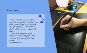
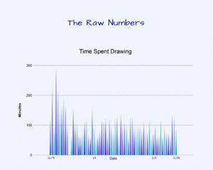
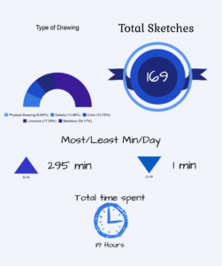
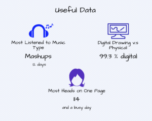
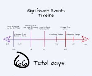
Other students, however, developed their infographics from the standpoint of self-reflection and personal development, using this assignment to investigate their own behaviors and practices. For example, Spencer Gordon examined one activity (drawing) in detail, and created his infographic with himself as the primary audience: “for my infographic, I chose to use myself as my audience because the infographic was about how I could improve as an artist. Of course, other people could see it and understand the information, but the application of the information was reserved for me and what I could interpret about it.” With this sense of audience, Spencer’s primary goal was reflective: “to show my progress, give me information on where I can improve in the future, and also be able to share something that I like doing without have to show drawings I am not content with.”
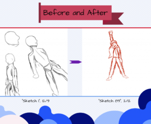
With this purpose and audience in mind, Spencer selected his content, based on data he had already collected about his drawing over three months: “I decided to focus on three different types of data to show my progress [in drawing] along with an example at the end. The first type is the amount of drawing done, measured in overall time drawn, length of the project, and how many drawings I have done. This is fairly obvious, a major component of getting better is practice. Second is the type of drawings I had done. I wanted to make sure I was focusing on all steps of the drawing progress, and which steps I could target as a potential growth area. This shows the split between digital and physical as well. Lastly, there are the fun facts, which don’t have anything to do with drawing itself, but just there because I wanted to have fun with a personal project. There is also an example included of how my sketches have improved over the months, mostly to make a final point and show how I’ve gotten better.”
Despite their different approaches, both students used infographics to discover, develop, and communicate narratives about themselves and their activities, engaging in a process of communication informed by their own sense of purpose, audience, and the conventions of visual communication.
Student Samples
Nadia Tung
- Infographic to the right and full-size graphic viewable here

Spencer Gordon –
- Infographic displayed below
